All the TOPdesk insight that matters, in one place
AureaDesk brings data from Incident Management, Change Management, Operations Management, Asset Management, Reservations Management and Operator License Management together in one clear dashboard. Workload combines data from several modules into one overall picture, and the Wallboard puts today’s key figures on a large screen for the team. At present AureaDesk has nine views.
All names and figures in the screenshots are fictitious and for illustration purposes only.
- Three layers per tab: Summary, Analysis and List.
- Search and sort: every table sorts per column, has a search field and shows 12, 25 or 50 rows per page.
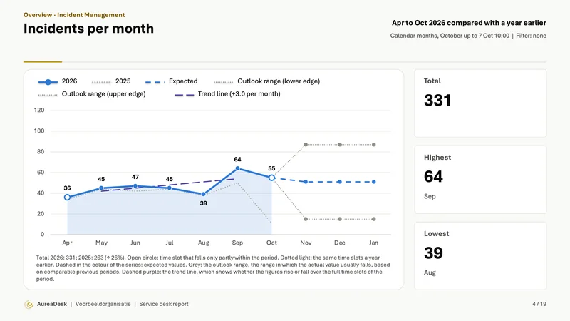
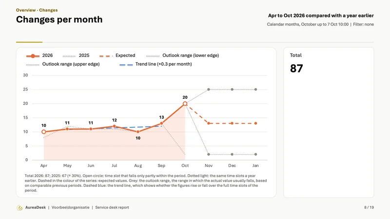
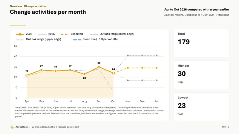
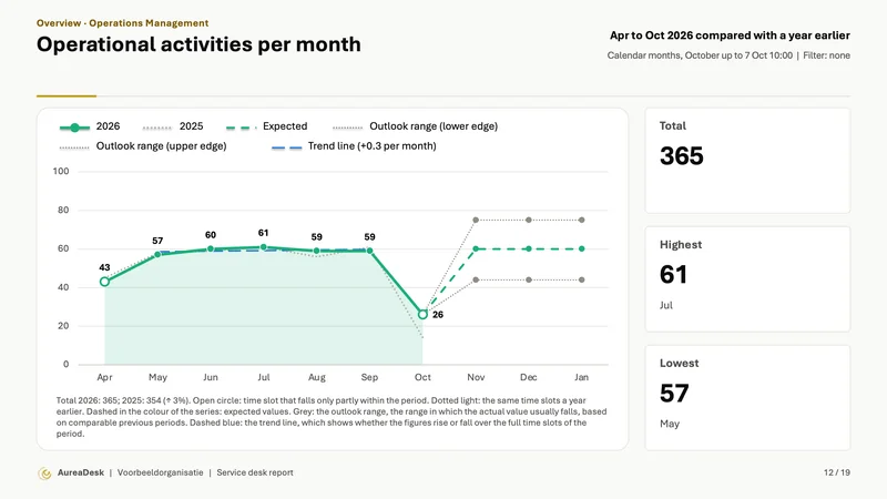
- Trend line and average in charts per period, and every chart also as a table.
- Notable changes: spikes and dips outside the normal range of the organisation’s own earlier figures, per tab and briefly on the Overview.
Overview
See the key figures for open incidents, SLA compliance, resolution time and customer satisfaction in one place.
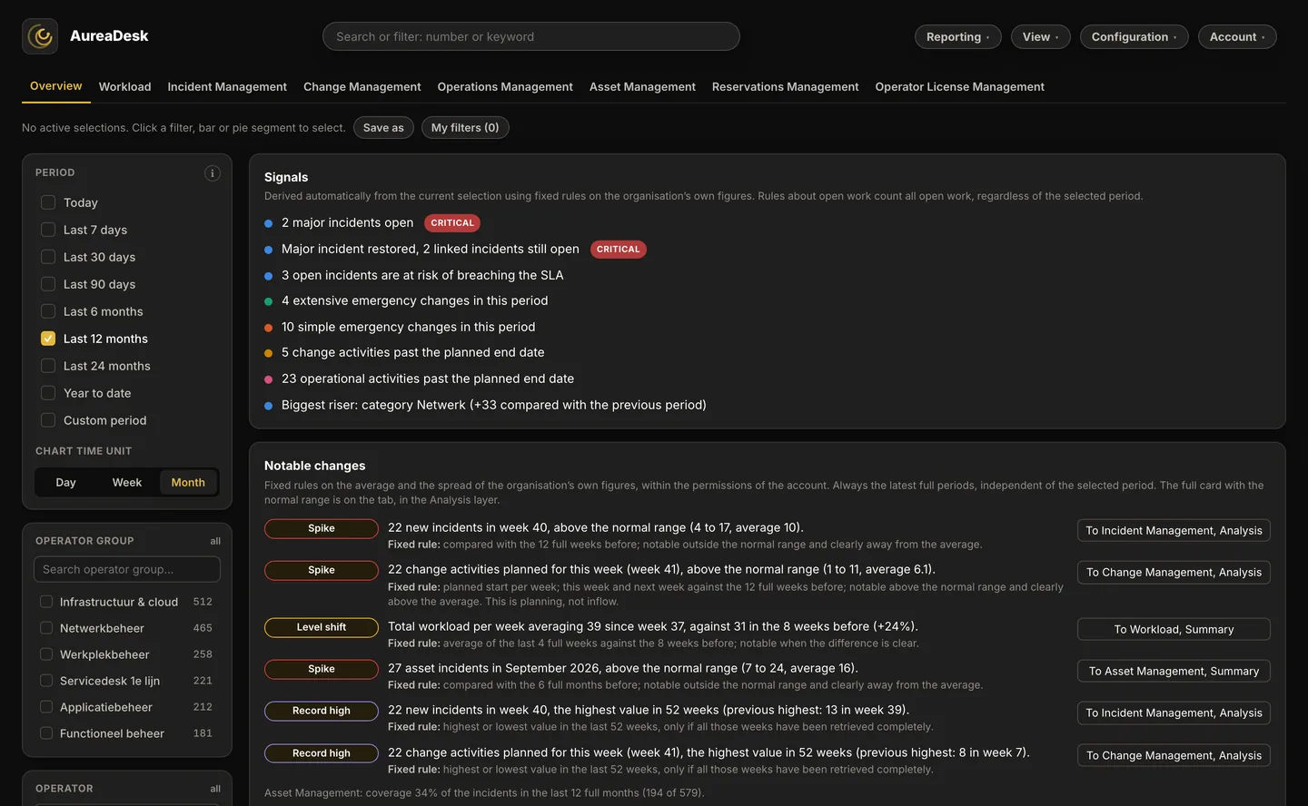
See what needs attention
At the top of the Overview you see the open major incidents and the separate open P1 incidents for the selected operator groups and branches, independent of the period filter.
- Per major incident: how long it has been open, the target date, the number of linked incidents and affected branches in your selection, and whether it is published on the portal
- Completion check: shows a restored major incident that still has open linked incidents, and the reverse
- Click through: from each row you open the incident in TOPdesk

The dashboard tells you what stands out
AureaDesk automatically compares the figures within your selection with the previous period and your configured targets. Notable developments and urgent matters appear at the top of the Overview tab, so you know where you can take action.
- Signals: a major incident still open, incidents about to breach their SLA, inflow above the usual level for that weekday, a drop in SLA compliance or the oldest incident still open; and likewise for changes (simple and extensive), change activities and, with the Operations Management module, operational activities: emergency changes, a marked rise or fall, activities past their planned end date and the oldest open change. Calculated from your own figures with fixed rules. The same signals sit at the top of the scheduled report email.

Workload
See how much work there is, how it is distributed and where the backlog is growing.
The Workload view brings together incidents, changes and change activities; with the Operations Management module, operational activities count too. Simple and extensive changes are shown separately, so you also see what the work is made up of. Per operator group and per operator, see how much work comes in, is picked up and is completed.
Make the case for how much capacity your team needs
Is the backlog growing while staffing stays the same? Or is there room to distribute the work differently? The Workload view helps you recognise developments and support capacity decisions.
- See simple and extensive changes separately.
- Compare the amount of work per operator group and per operator, with the number of active operators alongside; an administrator can switch off the figures per operator.
- See trends and a short-term outlook.
- Workload per operator group: per operator group one bar with received, picked up and completed, as numbers or in percent, with the marker More than average not yet picked up.
- Expected workload, Notable changes in total workload and the control chart per week.
This lets you base the conversation about work distribution and staffing on your own TOPdesk data. The numbers and types of work add context: not every task takes the same amount of time.

Wallboard
The Wallboard shows the working day on a large screen for the whole team.
The Wallboard shows what comes in today, is picked up and is completed. You also see, in Pro and Enterprise, the distribution of work per operator group and, if the administrator enables it, per operator.
New incidents, changes and activities appear as notifications after AureaDesk has retrieved them from TOPdesk, with their priority and type. The full-screen view adapts automatically to the available screen size.
Keep sight of today’s progress together
The Wallboard is designed for a large screen in the team room. Large figures and clear overviews show where work is flowing and where attention is needed.
You open the Wallboard from the View menu. The content fits the screen automatically, from an office monitor to a 4K television. Use the Rotation button to have the tables of recent incidents, changes and change activities cycle through their pages automatically.


Received, picked up and completed
Follow today’s flow through counts and percentages. This shows how much work comes in, how much has been picked up and how much has been completed.
Work distribution per operator group and operator (Pro and Enterprise)
See the work per operator group, broken down by type. Simple and extensive changes are shown separately. Below that are the most recent incidents, changes and change activities.
When a wallboard link is used, names and figures per operator are off by default. The administrator can switch them on per link.
New work in view
New incidents, changes and activities appear at the top right of the screen. At most six notifications are visible at a time and they disappear automatically, so the overview stays clear.
On your own screen too
Choose the period Today in the dashboard to see the figures from midnight. Then filter on your own name to see which work is assigned to you today.
A shared overview for your team
With the Wallboard, everyone looks at the same current figures. Together you see where work is piling up and where support is needed, so you can adjust during the day.
Want to use this in your team? Share this page with your team lead or request a free demo together.
Incident Management
Get a grip on open incidents, performance and the expected amount of work.
Filter by incident type, category, status, priority, impact, urgency, entry type, customer satisfaction, line, operator group, operator or branch. The key figures adjust automatically to your selection. You see open incidents, SLA breaches, response times, resolution times, reopenings, time spent and major incidents, among others. Reopenings require the TOPdesk reporting connection.
You also see the expected numbers for the next 7, 30 and 90 days; with Enterprise also for 6 months.
With the cross-tab you compare any two fields by count, average resolution time or SLA compliance. From the detail view you open the corresponding card directly in TOPdesk.
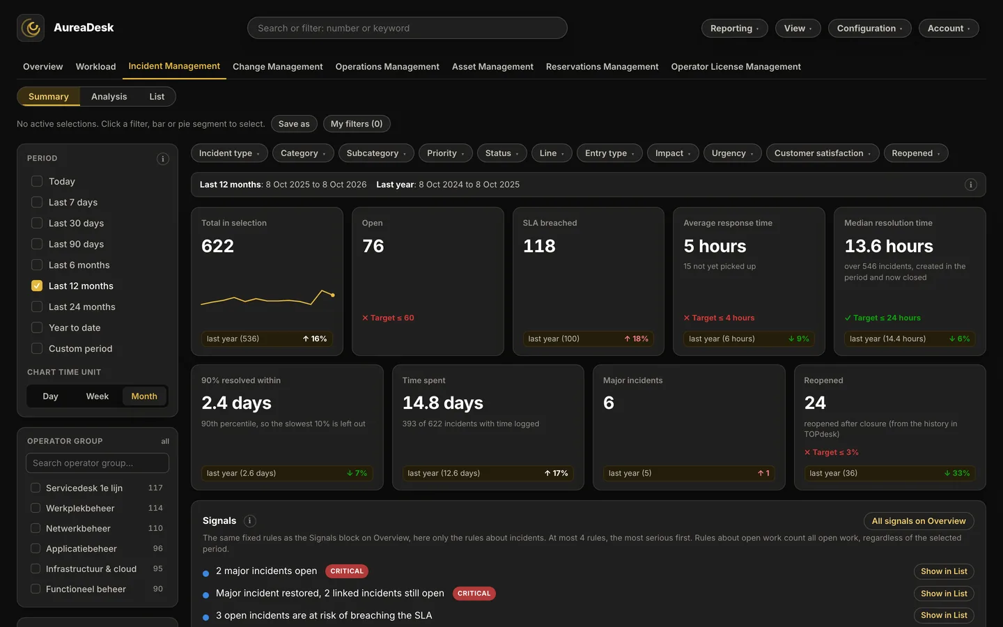
- Customer satisfaction priority matrix: per operator group or category the number of ratings against the average rating, in four quadrants. In every package, when customer satisfaction is switched on.
- Control chart per week (Pro and Enterprise): a key figure per week with a centre line and control limits; a week outside the limits gets a red dot.
- Expected completion (Pro and Enterprise): in the SLA horizon and the detail window an estimate of the moment of completion; an estimate, not a promise.
AureaDesk calculates the outlook from historical data in your TOPdesk environment. To do so, AureaDesk looks at earlier periods of equal length.
The result gives an indication of what you can expect based on earlier periods. Actual numbers may differ. The outlook appears when enough history has been built up.

- KPI targets (Pro and Enterprise): set a target for SLA compliance, resolution time, response time, open incidents and reopenings. Every tile shows at a glance whether the target is met, and the SLA compliance chart draws your target line.
- Backlog over time: day by day how many incidents were open, how many of those for more than 7 and 30 days, and how many with a breached SLA. The TOPdesk API only returns the current state; AureaDesk records it daily.
- Heatmap: per weekday and hour when most incidents come in, for staffing and peak moments.
- Signals in Teams or Slack (Pro and Enterprise): a threshold you set yourself arrives not only by email but also in the team’s channel.
Signals, the analysis cards (heatmap, backlog over time, ageing matrix, inflow and outflow, Pareto of causes, key figures over time, customer satisfaction in detail and, with the Operations Management module, compliance matrix), email signals on key figures of Incident Management, the cross-tab with your own value (count, resolution time, SLA) and sharing a view via link are included in Standard, Pro and Enterprise. KPI targets, signals in Teams or Slack and signals with more conditions, also outside Incident Management, are in Pro and Enterprise. Reopenings, response time, the cross-tab with counts, an email signal on SLA risk, export to Word and PowerPoint and Open in TOPdesk are in every package. The cards in this layer are extended continuously and may change in form.


Insight into resolution time and handovers
AureaDesk brings together how incidents and changes progressed. For incidents, this requires the TOPdesk reporting connection. You see at a glance which route they took via operator groups and how long they stayed with each operator group. AureaDesk shows which operator group an incident or change is and was with, and keeps that up to date.
- For changes, operator group changes are recorded from the moment of connecting; for incidents they come from the TOPdesk reporting connection
- Waiting time per operator group, in hours or days
- Visible in the detail view of every incident and change

Change Management
See what is changing, where changes sit and where delay creeps in.
Changes and their change activities are brought together in one view. See how many are running, which phase they are in, and where resolution time builds up. The same outlook applies here, up to 90 days (Enterprise: up to 6 months).
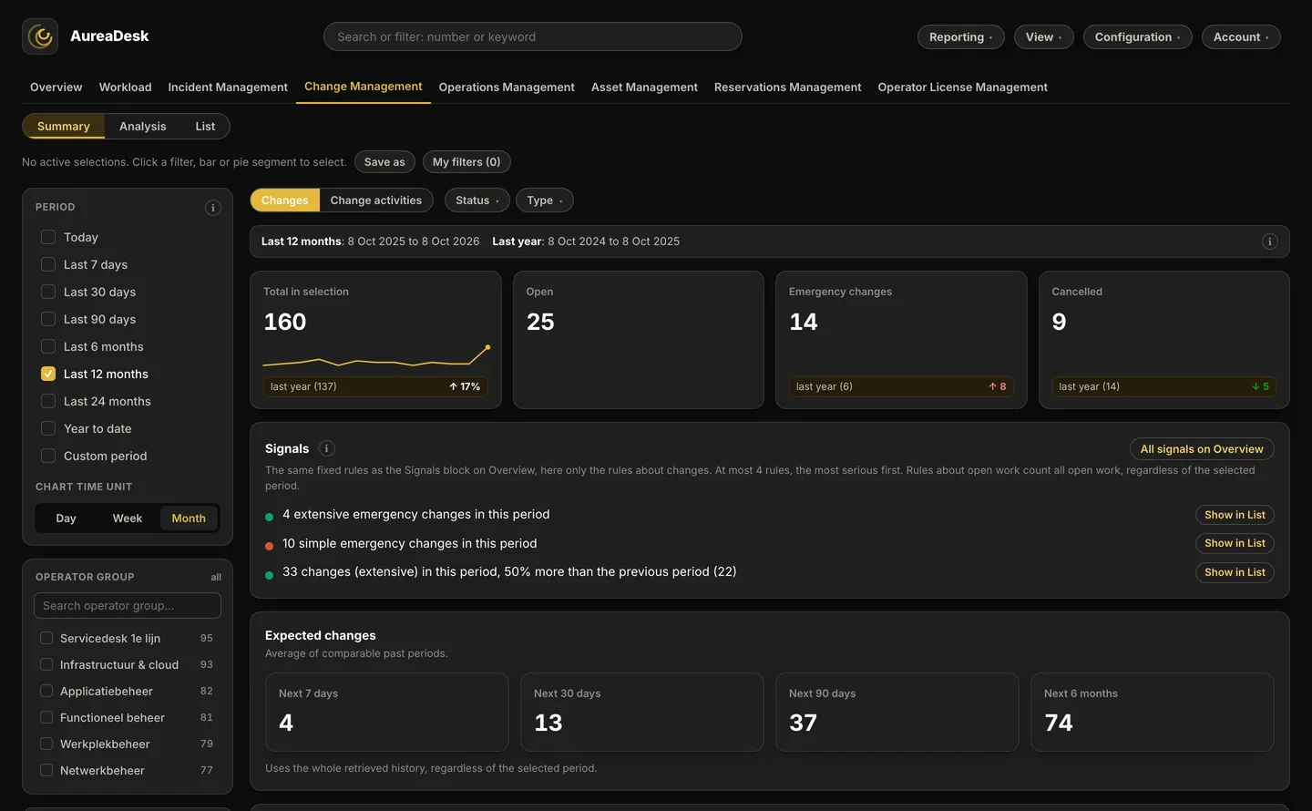
- Where things go wrong (Pro and Enterprise): per category or operator group the share of all changes next to the share of cancelled changes and emergency changes; for change activities, Where activities overrun.
- Expected resolution time per phase and expected remaining resolution time (Pro and Enterprise): an estimate per phase of extensive changes and for open change activities; not a promise.
- Changes implemented on time: per month the closed changes implemented on or before the planned implementation date, and those implemented after it.
- Notable changes in the planning: spikes, dips and shifts in the planned change activities per week.

Asset Management
Find out which assets are often involved in incidents and changes.
Per asset, see how many incidents and changes are linked to it, including incidents with priority P1 and P2. The timeline shows when incidents were reported and changes were carried out. That lets you investigate, for instance, whether failures began shortly after a change.
These insights help you decide which assets need further investigation, maintenance or replacement.
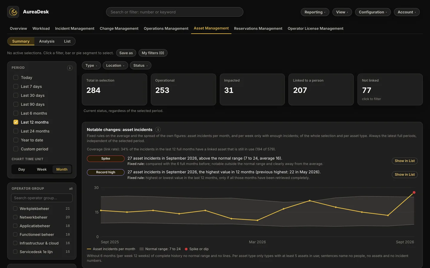
Recognise recurring failures and possible links with changes
AureaDesk brings together linked incidents and changes per asset. You see how often an asset is involved in incidents, what priority those incidents have and which changes were carried out around the same period.
- Incidents and changes per asset: see the numbers in one overview, ordered by the number of incidents.
- Timeline per asset: open all linked incidents and changes from newest to oldest and click through to each incident and change.
- P1 and P2 incidents: see which assets are most often involved in high-priority incidents.
- Assignment to persons: see who assets are assigned to, which assets are not linked and which persons have the most assets.
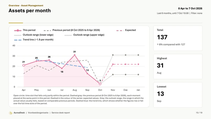
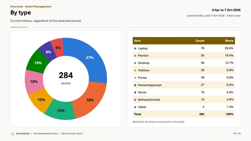
- Asset Management over time: follow per month how many assets have been added since connecting and see the breakdown by type, status and location.
- Filterable asset list: find assets by assigned person, branch, location and status, among others.
- Failure rate per asset type and branch or location: incidents per 100 assets per year in a grid; no figure below 5 assets.
- Trend per asset type: incidents per month over the latest 12 full months, the fastest risers on top.
- Incidents and changes per asset and Assets with the most P1/P2 incidents follow the selected period and filters, also in PDF, Word and PowerPoint.


Operator License Management
Get insight into the use of paid operator licences and check whether access rights still fit each person’s work.
AureaDesk shows which paid operators have had no activity in the past 90 days, with their permission groups alongside. Changes of job title or department are flagged too, so you can check whether accounts and rights still fit the current position.
Only pay for operators who are actually active
Every operator with a paid TOPdesk licence carries a licence cost. But are all those accounts still genuinely in use? AureaDesk makes clear which operators have had no activity on incidents, changes and, with the Operations Management module, operational activities in the past 90 days.
That quickly shows where licence costs may be running unnecessarily, and where access rights deserve attention.
- Paid operators without recent activity: including the permission groups they are currently attached to.
- Changed job title or department: a flag for operators whose job title or department has changed, so you can check whether their rights and operator groups still match their current position.
- Mark as reviewed: tick off reviewed accounts, one by one or with Mark all reviewed, so it is clear what has already been assessed and you can pick up easily at the next review.
- Also in Word and PowerPoint, with numbers only.
Changes of job title or department deserve particular attention. When somebody moves internally, old rights can stay in place while new ones are added. The reverse also happens: an operator missing from the operator group where their current work arrives. In the first case unnecessary or unwanted access rights build up, which matters for security and audits. In the second, incidents or work may not reach the right operator, with possible consequences for resolution time. AureaDesk therefore helps not only to spot possibly unnecessary licence costs, but also to review the setup of operators and access rights periodically and with evidence behind it.

Operations Management
See which planned work has been completed and which operational activities are running behind.
See how many operational activities fall within your selection, how many are open or completed, and which have passed their planned end date.
The breakdown by status, category and operator group shows where attention is needed. Charts show the trend per period. With the Operations Management module, operational activities also count in the Workload view, so you get a more complete picture of the work in your team.
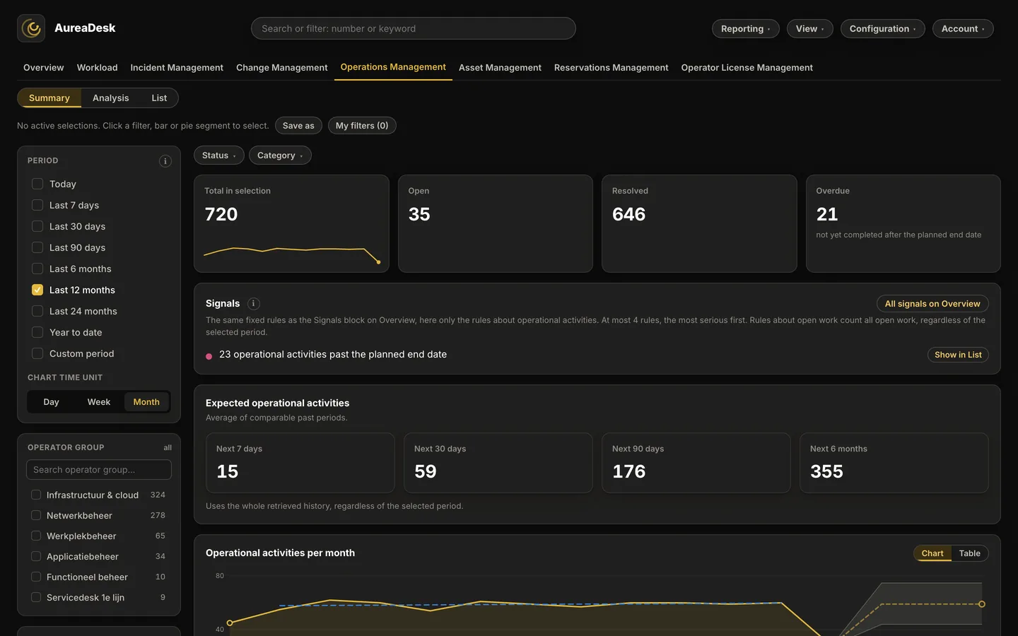
- Expected operational activities in the Summary and Notable changes in compliance per week.

Reservations Management
All reservations, conflicts and open bookings in one overview
As reservations grow, it becomes harder to see quickly where the friction is. Double bookings, reservations that run past their planned end time, and requests that stay open all need timely follow-up.
With the Reservations Management module, AureaDesk brings that information together in a single overview, with the same filters and the same way of working as the rest of the platform.
- Reservations by period, location and operator group: from meeting rooms to equipment and other bookable facilities.
- Reservation conflicts: recognise overlapping bookings for the same facility and assess where action is needed.
- Overdue reservations: a flag for reservations where the planned end date has passed but the reservation has not been closed.
- Breakdown by reservation status: including requested, planned, rejected and cancelled, for a clear picture of the current flow.
- Expected reservations in the Summary.
That gives you not only insight into what is being booked, but also into where action is needed. AureaDesk helps surface friction sooner and gives administrators one central overview for the daily follow-up of reservations. Reservations Management can be added to Standard and Pro and is included in Enterprise.

Export with the period and filters of the screen
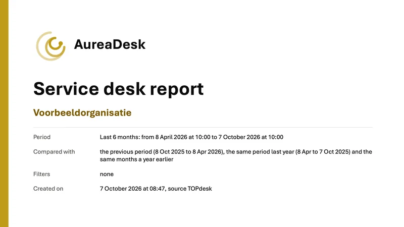
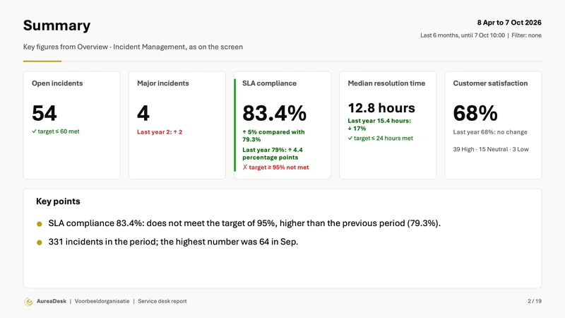
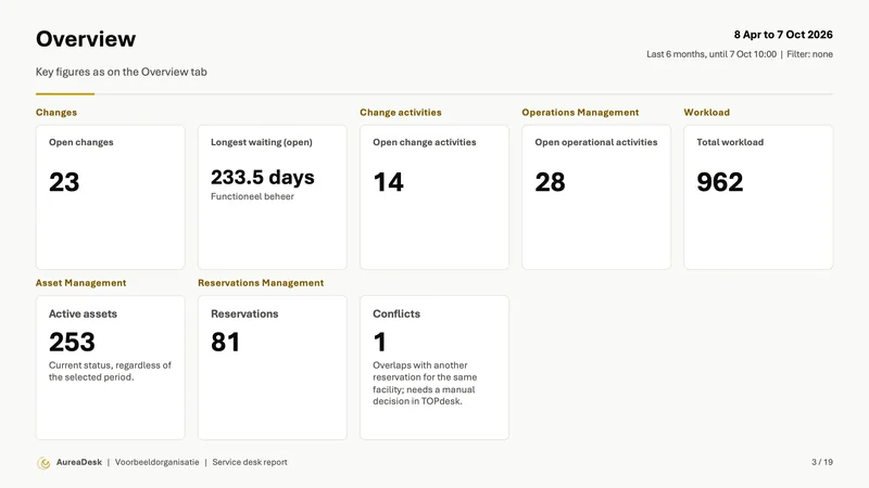
The Reporting menu exports to PDF, Word or PowerPoint. The period and the filters of the screen also apply in the file. PDF gives the selected tabs, Word and PowerPoint a report or presentation with key figures and charts.
- PDF: a print-optimised view
- Word: a report with a cover page, table of contents, summary with key points and, for every chart, a table with figures, ready to extend with your own commentary for a monthly or quarterly report
- PowerPoint: a presentation with a summary, the key figures and, per chart, a slide with an editable PowerPoint chart, for use in a meeting; Word and PowerPoint can also be chosen as the format for the scheduled report
- Word and PowerPoint in a new structure: per tab key figures and charts with a table, key points and explanation; an export window shows the progress. Formats: PDF, Word and PowerPoint.
- Scheduled by email: have a fixed report sent round automatically, including to colleagues without an account; in every package, the signals of that moment sit at the top
- Signals by email, Teams or Slack: set a threshold on a key figure and get a signal after AureaDesk finds during a check that it has been exceeded, in every package on key figures of Incident Management, from SLA risk to reopenings; in Pro and Enterprise also on key figures outside Incident Management and in a Microsoft Teams or Slack channel
- Signals with more conditions (Pro and Enterprise): fixed threshold, change compared with the previous measurement or deviating operator group; delivery each time or bundled in a daily digest; sharing with a colleague.
- Link to this view (in every package): copy a link that carries your tab and all your filters; whoever opens it sees exactly the same selection
Word and PowerPoint contain key figures and charts of the selected tabs. Not included in the file are, among others, lists with rows, cards per person (except Workload per operator in Pro and Enterprise, if the Figures per operator setting is switched on; an administrator can switch it on or off), matrix cards and the new analysis cards, such as Notable changes, Where SLAs are breached, the control chart and the expected remaining resolution time.

On your wall screen, laptop and phone
Use AureaDesk wherever you need the figures: in the team room, at your desk, during a meeting or on the move.
On a large screen, the Wallboard gives your team a shared overview. On your laptop you can leave the dashboard open all day. The data refreshes automatically, while your filters and selected view are kept.
During a stand-up, team meeting or management meeting, you filter on the relevant operator group, period or priority. For follow-up questions, you click through to the underlying data.
On your phone, too, you use the same environment. AureaDesk adapts the layout to the screen: filters sit in an expandable menu, tiles appear one below the other and you switch between views with the horizontal navigation. There is no separate app to install.


AureaDesk on your phone. See the figures during a stand-up, on the way to a meeting or during an outage. You use the same address and sign in the same way as on your laptop.
Your dashboard, in light or dark
AureaDesk automatically follows the light or dark appearance of your computer or phone. Prefer to choose for yourself? Select Light or Dark in the View menu. Your preference is saved.


Explore AureaDesk yourself: free, no strings
Get free access to the demo environment and look at AureaDesk whenever it suits you. Prefer to go through the dashboard together? Then choose a personal online demo.